Typography is not just about picking a nice font. It controls how long someone stays on your page, whether they trust your content, and whether they ever come back. Most website owners obsess over site speed and backlinks while ignoring the one thing users actually interact with every second they spend on the page: text.
A 2023 Adobe study found that poor typography choices contribute to a 40% higher bounce rate. That means visitors are leaving your site faster simply because your text is hard to read or visually overwhelming. If you are dealing with high bounce rates and low dwell time, your typography might be the silent reason behind it.
This guide covers the five most common typography mistakes that damage your website’s user experience, along with specific fixes for each one.
What Are Typography Mistakes in Web Design?
Typography mistakes are design decisions related to fonts, text size, spacing, contrast, and hierarchy that make content harder to read or visually chaotic. These are not spelling errors. They are structural choices that affect how the human brain processes your content.
Poor typography reduces readability, creates cognitive load, and signals an unprofessional or untrustworthy site. Good typography does the opposite: it guides the eye, establishes trust, and keeps users reading.
Mistake 1: Using Too Many Fonts on One Page
Using five or six different typefaces on a single page is one of the fastest ways to destroy visual cohesion. Each font carries its own personality and weight. When multiple competing fonts appear on the same page, they pull attention in different directions, which creates what designers call “visual noise.”
Your visitor’s brain has to decode each new style it encounters. That mental work adds up fast, and most users do not consciously realize it is happening. They just feel something is off and leave.
The fix is simple. Stick to two font families maximum: one for headings and one for body text. A pairing like a clean sans-serif heading font with a readable serif body font creates hierarchy without confusion. Google Fonts offers thousands of free options, and well-known pairings like Inter + Lora or Montserrat + Roboto are used on high-traffic sites for good reason.
If you need visual variety, achieve it through font weight, size, and spacing within the same font family rather than introducing a new typeface.
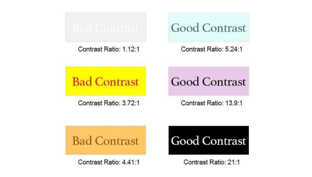
Mistake 2: Ignoring Text Contrast Against the Background
Light gray text on a white background might look clean and minimal on your high-end monitor. On an average screen in sunlight, it is nearly invisible.
Low contrast is one of the most damaging and most overlooked typography mistakes. It excludes users with visual impairments and frustrates everyone else. The Web Content Accessibility Guidelines (WCAG) set by the W3C recommend a contrast ratio of at least 4.5:1 for normal body text and 3:1 for large text. Most low-contrast designs fail this standard by a wide margin.
The fix: dark text on light backgrounds and light text on dark backgrounds. These two combinations work. Anything in between usually does not. Tools like WebAIM’s Contrast Checker let you test any color pair in seconds and tell you whether it passes WCAG standards.
Before you publish any page, test the contrast on an older device or a phone under bright light. What passes on your MacBook Pro may fail on a budget Android screen.
| Text / Background Combination | Contrast Ratio (approx.) | WCAG Pass? |
| Black (#000) on White (#FFF) | 21:1 | Yes |
| Dark Gray (#333) on White (#FFF) | 12.6:1 | Yes |
| Light Gray (#999) on White (#FFF) | 2.85:1 | No |
| White (#FFF) on Medium Blue (#4A90D9) | 3.0:1 | Borderline |
| White (#FFF) on Dark Navy (#1A2E44) | 13.2:1 | Yes |
Mistake 3: Wrong Line Height and Line Length
Line height (the vertical space between lines of text) and line length (how wide a block of text is) are two typographic settings most website owners never touch. Both have a significant impact on how comfortable your content is to read.
Line height too tight: Lines feel cramped. The eye struggles to find the start of the next line after finishing one.
Line height too loose: The reading rhythm breaks. Paragraphs feel disconnected.
The U.S. Web Design System, maintained by the U.S. federal government for accessibility compliance, states that longer body text should have a line height of at least 1.5. Most designers target a range between 1.5 and 1.8 for paragraph text. Heading text can go slightly lower, between 1.1 and 1.35, since headings are shorter and scanned rather than read continuously.
Line length matters just as much. Google’s Material Design guidelines recommend 40 to 60 characters per line for standard body text on mobile, and up to 120 characters per line on wide desktop layouts with increased line height. Lines that are too short create a choppy, fragmented reading experience. Lines that are too wide force the eye to travel too far, making it easy to lose your place.
The fix:
- Set body font size to at least 16px on desktop
- Set line height to 1.5 to 1.7 for paragraph text
- Limit paragraph width using max-width: 680px to 750px in your CSS
Mistake 4: No Visual Hierarchy in Headings
Visual hierarchy tells the reader what matters most on a page. Without it, every block of text carries equal weight, and users have no way to scan efficiently.
Most people do not read web pages word for word. They scan headings, subheadings, and bolded phrases first. If your H1, H2, and H3 headings look almost the same size, that scanning behavior breaks down entirely.
Apart from text size, how you format your headings also plays a huge role in user engagement. For instance, choosing the right title capitalization to boost CTR ensures your headings look clean and professional. Depending on your industry, you might want to follow a specific editorial standard—see our breakdown of AP Style vs. Chicago Manual to decide which style fits your brand best.
One common mistake is setting headings too close in size to each other. For example, placing an H1 at 28px and an H2 at 24px creates a 4px difference that the human brain barely registers. Design resource IKA Agency recommends a minimum 1.25x ratio between heading levels, with 1.5x being far more effective for actual readability.
A typical hierarchy that works:
- Body text: 16px
- H3: 20px to 22px
- H2: 26px to 30px
- H1: 40px to 48px
The fix is not to use more fonts. It is to use dramatic size differences, font weight variation, and spacing to signal importance. Bold an H2 and add extra spacing above it. That single change improves how users navigate a long article.
Mistake 5: Typography That Does Not Work on Mobile
Over 50% of global web traffic now comes from mobile devices, according to Statista data cited in multiple web design studies. Yet many websites still have typography settings that were designed on a desktop and never tested on a phone.
Common mobile typography failures include:
- Font sizes that shrink below 12px on small screens
- Line lengths that stretch edge to edge with no padding
- Tap targets (buttons and links) placed too close to body text, creating accidental taps
Responsive typography means your font sizes and line heights adjust to the screen displaying them. Toptal’s web typography guide recommends font sizes of 12px to 16px for mobile, 15px to 19px for tablets, and 16px to 20px for desktops. These are not fixed rules but ranges that depend on the specific typeface being used.
The fix: test your live site on actual devices, not just a browser resized to a smaller window. Pay attention to how paragraph text looks on a phone held in one hand in landscape orientation, which is how most people actually read on mobile. If the text requires pinching or zooming, the typography is broken.
Quick Reference: Typography Mistakes vs. Best Practices
| Typography Mistake | What Goes Wrong | Best Practice Fix |
| Too many fonts | Visual noise, cognitive load | Max 2 font families |
| Low text contrast | Inaccessible, hard to read | 4.5:1 contrast ratio minimum |
| Ignoring line height | Eye fatigue, poor rhythm | Line height 1.5 to 1.7 for body |
| No heading hierarchy | Users cannot scan | 1.5x size ratio between levels |
| Non-responsive type | Broken mobile experience | Test on real devices, use responsive sizing |
Why Typography Mistakes Hurt SEO Too
Typography is not just a design concern. It directly affects the metrics that search engines use to evaluate page quality. When users find your text hard to read, they leave quickly. High bounce rates signal to search engines that your page did not satisfy the user’s intent.
Additionally, the Core Web Vitals standard introduced by Google includes Cumulative Layout Shift (CLS) as a ranking factor. Web fonts that load late or shift the page layout as they render contribute to poor CLS scores. Choosing system-safe fonts or properly preloading web fonts prevents this.
According to research cited by Backlinko, Google’s top-ranking pages tend to correlate with lower bounce rates. Typography that keeps users reading directly supports that outcome.
Fixing layout shifts and typography on an established site often requires auditing hundreds of pages at once. If you are updating old blog posts to improve readability and look more professional, you can save hours of manual work by learning how to fix capitalization in bulk text to clean up your headings instantly.
Frequently Asked Questions
What is the most common typography mistake on websites?
Low text contrast is the most common mistake. Light gray text on white backgrounds fails WCAG accessibility standards and frustrates users on average screens.
What font size should I use for body text on a website?
Use a minimum of 16px for desktop body text. For mobile, 14px to 16px is the standard range. Going below 12px on any device creates a poor reading experience.
How many fonts should a website use?
Two font families is the standard recommendation: one for headings and one for body text. Using more creates visual noise and slows down page loading if each font requires a separate file.
What is a good line height for web typography?
For paragraph text, a line height between 1.5 and 1.7 is considered ideal. Heading text can use a tighter line height of 1.1 to 1.35.
Does typography affect SEO rankings?
Typography affects user behavior, which affects SEO. High bounce rates from unreadable text signal poor user experience to search engines. Web fonts also affect Core Web Vitals scores, which are a confirmed Google ranking factor.
What contrast ratio is required for accessible web text?
The Web Content Accessibility Guidelines (WCAG) require a contrast ratio of at least 4.5:1 for normal body text and 3:1 for large text (18px or 14px bold).
What is visual hierarchy in typography?
Visual hierarchy is the system of size, weight, and spacing differences between headings and body text that tells users what to read first and what to skip. Without hierarchy, users cannot scan efficiently.
Why does line length matter for readability?
Lines that are too long force the eye to travel far across the screen, making it easy to lose your place. Lines that are too short break reading rhythm. The ideal range is 60 to 80 characters per line for desktop body text.
How does typography affect mobile UX?
On mobile, font sizes that are too small require zooming, line lengths that span the full screen create fatigue, and clickable elements placed near text cause accidental taps. All of these increase bounce rate.
What tools can I use to fix typography contrast issues?
WebAIM’s Contrast Checker is the most widely used free tool. Enter your foreground and background hex codes and it tells you whether the combination passes WCAG standards.
Can bad typography hurt conversions?
Yes. If users struggle to read a call to action, product description, or pricing page because of poor typography, they are less likely to take the desired action. Readability directly connects to conversion rates.

Hi, I’m Sidra Azeemi, a freelance content writer and guest post specialist with 3+ years of experience. I offer content writing and on-page SEO services. I write about celebrities, net worth, and entertainment.